




What goes in a server monitoring dashboard in Metabase?
A server monitoring dashboard watches the classic fleet signals — CPU, memory, and disk by server group, uptime, disk fill forecasts, service status, and the hosts eating the most resources. Metabase builds it from metric snapshots in your warehouse, whether they come from Prometheus, Datadog, or your own agents — cloud-specific fleets get their own AWS monitoring view, and database hosts a PostgreSQL monitoring one.
For: sysadmins, SREs, and platform teams. Grain: one row per server per hour (rollups), one-minute data for status cards. Refresh: every few minutes for status; hourly for trends.
What does a server monitoring dashboard look like?
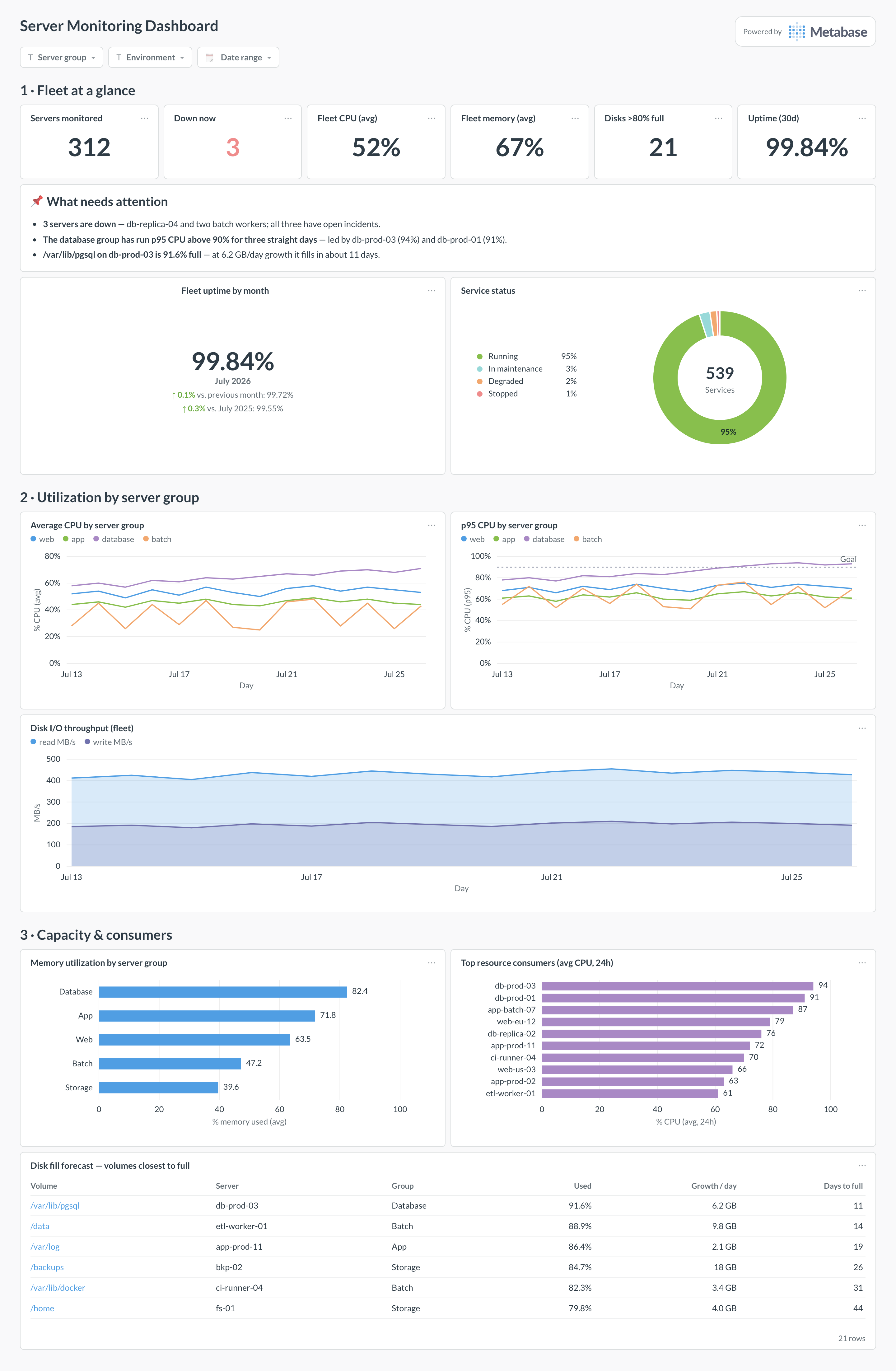
Here’s the layout this guide builds. Fleet status leads — servers down and uptime are the glanceable verdict — then utilization by server group, where averages and p95 sit side by side so hot groups can’t hide, and finally capacity and services: disk forecasts, service status, and the top consumers to blame when a group runs hot.
Which cards belong on a server monitoring dashboard?
The eight below cover the three ways a fleet gets in trouble: a host dies, a group runs out of headroom, or a disk quietly fills.
- Fleet uptime by month, with month-over-month comparison (trend)
- CPU utilization by server group, average per hour (line)
- p95 CPU by server group — the hot edge the average hides (line)
- Memory utilization by server group, current average (row)
- Disk I/O throughput, read and write, fleet-wide (area)
- Service status mix — running, degraded, stopped, in maintenance (donut)
- Top resource consumers — the ten busiest hosts by CPU (row)
- Disk fill forecast — volumes by days to full at current growth (table)
What data does the dashboard need?
servers— inventory withserver_id,server_group, environment, and an active flag.server_metrics— per-server samples ofcpu_pct,mem_pct,disk_free_gb, and I/O rates, rolled up hourly.service_checks— service name, host, and running/degraded/stopped status per check.volume_snapshots— per-volume capacity and used bytes, daily, for growth and fill forecasts.- Uptime pings or agent heartbeats — one row per server per check, for the uptime trend and the down-now count.
How do you build it?
- Export metrics from your collector into the warehouse: pull the Prometheus query API hourly (or use your agent’s export), keeping avg, p95, and max per server per hour.
- Tag every server with a
server_groupin the inventory table — web, app, database, batch, storage — because every comparison card on the page groups by it. - Build the utilization cards from the hourly rollups (the SQL below), one shared model so average and p95 cards agree on the population.
- Compute the disk forecast from
volume_snapshots: daily growth over 30 days, days-to-full, sorted ascending, top 10 into the table. - Add filters for server group, environment, and date range, and let the status cards auto-refresh while trend cards stay on hourly cache.
Example card SQL
WITH hourly AS (
SELECT
  s.server_group,
  date_trunc('hour', m.sampled_at)      AS hour,
  AVG(m.cpu_pct)                        AS avg_cpu,
  PERCENTILE_CONT(0.95)
    WITHIN GROUP (ORDER BY m.cpu_pct)   AS p95_cpu,
  AVG(m.mem_pct)                        AS avg_mem,
  MIN(m.disk_free_gb)                   AS min_disk_free_gb
FROM server_metrics m
JOIN servers s ON s.server_id = m.server_id
WHERE m.sampled_at >= now() - interval '14 days'
GROUP BY s.server_group, date_trunc('hour', m.sampled_at)
)
SELECT
server_group,
hour,
ROUND(avg_cpu, 1)           AS avg_cpu_pct,
ROUND(p95_cpu, 1)           AS p95_cpu_pct,
ROUND(avg_mem, 1)           AS avg_mem_pct,
ROUND(min_disk_free_gb, 0)  AS min_disk_free_gb
FROM hourly
ORDER BY server_group, hour;
Related
Metrics
Integrations
Dashboards
FAQ
What is a server monitoring dashboard?
How is this different from an IT monitoring dashboard?
What about cloud instances and database servers?
Why do fleet averages look fine while servers are on fire?
How do I forecast when a disk fills up?
Should I monitor servers with Metabase or Grafana?
What snapshot cadence should the warehouse tables use?
MIN(disk_free_gb) rather than the average for disk, because the minimum is what pages you. Cheap queries are also what makes the auto-refresh wall display viable.