





What does a CI pipeline health dashboard show in Metabase?
A CI pipeline health dashboard shows whether builds pass, how long they take, and which tests waste the team's time. It's built from run history synced from tools such as Jenkins, CircleCI, Buildkite, and GitHub Actions.
For: platform and developer-experience teams. Grain: one row per pipeline run, plus optional per-test results for flakiness.
What does a CI pipeline health dashboard look like?
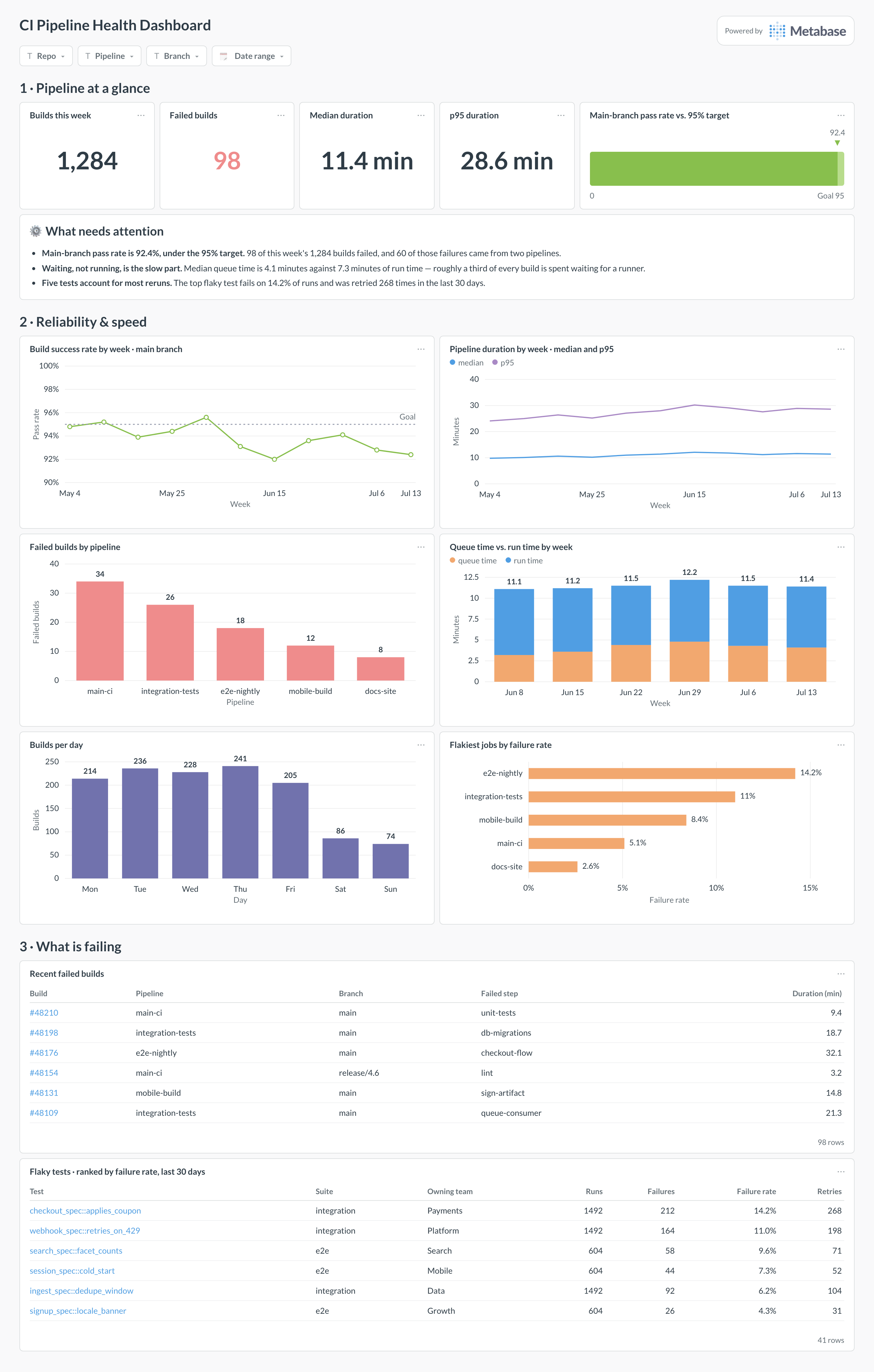
Here's the layout this guide builds: pass rate and duration at the top, then the reliability and speed trends across the week, then the pipelines, jobs, and tests actually responsible for the failures. Read it when CI feels slow or flaky and you need to know which part to fix first.
Which cards belong on a CI pipeline health dashboard?
- Build success rate by week on the main branch (line)
- Failed builds by pipeline (bar)
- Median and p95 pipeline duration by week (line)
- Queue time vs. run time (stacked bar)
- Flaky tests ranked by failure rate (table)
- Builds per day (bar)
What data does the dashboard need?
pipeline_runsat run grain — pipeline, branch, result,queued_at/started_at/finished_at, and duration.- Optional
test_resultsat test grain, for the flaky-test ranking. - Synced from Jenkins, CircleCI, Buildkite, Azure DevOps Pipelines, GitHub Actions, or GitLab CI into a database or warehouse.
How do you build it?
- Sync run history into
pipeline_runs— Metabase reads databases, not CI tools directly, so land the data with an ETL connector or the provider's API. - Keep all three timestamps so queue time and run time stay separable — the two problems have different fixes.
- Filter headline cards to the main branch; feature-branch failures are the system working, not a health problem.
- Build the success-rate and duration trends first, then add the flaky-test table once
test_resultsis flowing.
Example card SQL
Build success rate and median duration by week, main branchPostgreSQL
SELECT
  DATE_TRUNC('week', started_at) AS week,
  ROUND(
    100.0 * COUNT(*) FILTER (WHERE result = 'success')
    / NULLIF(COUNT(*), 0), 1
  ) AS success_rate_pct,
  ROUND(
    (PERCENTILE_CONT(0.5) WITHIN GROUP (
      ORDER BY EXTRACT(EPOCH FROM finished_at - started_at)
    ) / 60.0)::numeric, 1
  ) AS median_duration_min
FROM pipeline_runs
WHERE branch = 'main'
  AND started_at >= CURRENT_DATE - INTERVAL '12 weeks'
GROUP BY 1
ORDER BY 1;
Related
Metrics
Integrations
Dashboards
FAQ
What is a CI pipeline health dashboard?
A CI pipeline health dashboard is the build-health roll-up for a platform or developer-experience team: the build success rate on the main branch, how long pipelines take, where runs sit in queue, and which tests fail intermittently. The CI tool shows one run at a time; this dashboard sits on the run history in a database, so "CI feels slow this month" becomes a chart instead of an argument.
What data sources feed a CI pipeline health dashboard?
Run history from wherever builds happen: Jenkins, CircleCI, Buildkite, Azure DevOps Pipelines, GitHub Actions, or GitLab CI. Metabase doesn't connect to these tools directly — it reads databases and warehouses — so sync run records into a
pipeline_runs table with an ETL tool or the CI provider's API, then point Metabase at the result.Why split queue time from run time?
Because the fixes are different. A slow total pipeline duration caused by queueing is a capacity problem — add runners or rebalance agents — while slow run time is a workload problem: cache dependencies, parallelize suites, or split the pipeline. The queue-vs-run card splits
queued_at, started_at, and finished_at so you buy hardware only when hardware is the bottleneck.How do you find flaky tests with this dashboard?
Sync per-test outcomes into a
test_results table and rank tests by failure rate on the main branch, where legitimate failures should be rare. A test failing 8% of runs while the code around it barely changes is flaky, and each retry it forces inflates duration and erodes trust in red builds. The flaky test rate tracks the aggregate; the ranked table names the individual offenders to quarantine or fix.How does CI pipeline health relate to DORA metrics?
CI health is upstream of delivery performance. A failing or slow pipeline caps deployment frequency and stretches lead time no matter how fast the team writes code, so when the DORA dashboard trends the wrong way, this dashboard is often where the cause shows up first — a success-rate dip, a duration regression, or a flaky suite forcing retries.