




What goes in a Databricks monitoring dashboard in Metabase?
A Databricks monitoring dashboard tracks DBU spend by SKU, workspace, and team tag alongside the things that drive it — job failure rate, cluster utilization, Photon adoption, and SQL warehouse latency. Metabase connects to Databricks natively, so every card is plain SQL over Unity Catalog system tables — no billing export, no API polling job.
For: data platform and ML platform teams, and whoever signs off on the Databricks invoice. Grain: one row per usage record, job run, and query, rolled up daily.
Source:
system.billing, system.lakeflow, system.compute, system.query (enabled per schema by an account admin).
What does a Databricks monitoring dashboard look like?
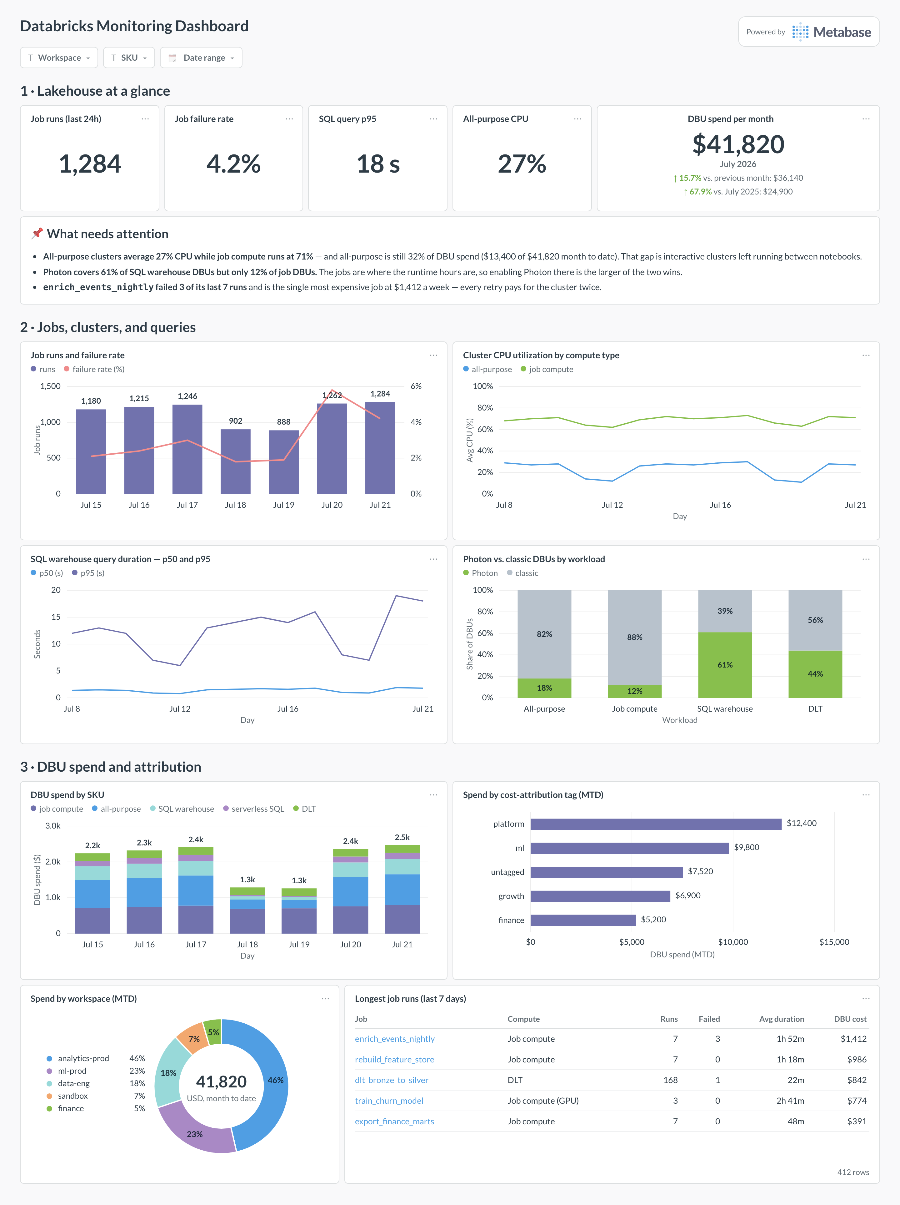
Here’s the layout this guide builds. Workspace-level numbers and the month’s DBU spend sit at the top; the middle section is the workload — job runs and failures, cluster utilization, query duration, and how much of it runs on Photon; the bottom section follows the money, from SKU and workspace down to the individual jobs.
Which cards belong on a Databricks monitoring dashboard?
Eight cards. Spend is split three ways — by SKU, by workspace, by tag — because those are the three arguments people actually have, and the workload cards beside them explain each number rather than just reporting it.
- Job runs and failure rate per day (combo)
- Cluster CPU utilization by compute type — all-purpose vs. job compute (line)
- SQL warehouse query duration, p50 and p95 by day (line)
- Photon vs. classic DBUs by workload (100% stacked bar)
- DBU spend by SKU per day — job compute, all-purpose, SQL warehouse, serverless, DLT (stacked bar)
- Spend by cost-attribution tag, month to date, with an explicit untagged bucket (row)
- Spend by workspace, month to date (donut)
- Longest job runs, with failed-run count and DBU cost (table)
What data does the dashboard need?
system.billing.usage— one row per usage record: workspace,sku_name,usage_quantityin DBUs,usage_date, andcustom_tags.system.billing.list_prices— effective list price per SKU over time, joined on the price validity window so historical days keep their historical rate.system.lakeflow.job_run_timelineandsystem.lakeflow.jobsfor run counts,result_state, duration, and job names (previously thesystem.workflowschema).system.query.historyfor SQL warehouse queries — duration, rows produced, bytes read, and the statement text.system.compute.clustersandsystem.compute.node_timelinefor cluster configuration, autoscaling, and per-node CPU and memory utilization.- Your discount or committed-use rate, held in one model, if list price is not what you actually pay.
How do you build it?
- Have an account admin enable the
billing,lakeflow,compute, andquerysystem schemas, then connect Databricks to Metabase with a service principal that hasSELECTonsystem. - Run the dashboard’s queries on a small serverless SQL warehouse with a short auto-stop, so the monitoring does not become a line on the chart it is drawing.
- Model spend once:
usagejoined tolist_priceson the price validity window, with SKU grouped into readable buckets andcustom_tagsflattened into columns. Every cost card reads that model. - Build the SKU and tag-attribution cards first — they settle budget conversations — then the utilization, Photon, and job-failure cards that say what to change.
- Add filters for workspace, SKU, and date range, and alert the platform channel when daily spend or job failure rate crosses its threshold.
Example card SQL
SELECT
u.usage_date                                         AS day,
u.workspace_id,
u.sku_name,
u.custom_tags['team']                                AS team,
ROUND(SUM(u.usage_quantity), 1)                      AS dbus,
ROUND(SUM(u.usage_quantity * p.pricing.default), 2)  AS est_cost_usd
FROM system.billing.usage u
JOIN system.billing.list_prices p
ON  u.sku_name = p.sku_name
AND u.cloud    = p.cloud
AND u.usage_start_time >= p.price_start_time
AND (p.price_end_time IS NULL
     OR u.usage_start_time < p.price_end_time)
WHERE u.usage_date >= current_date() - INTERVAL 14 DAYS
AND u.usage_unit = 'DBU'
GROUP BY 1, 2, 3, 4
ORDER BY 1, est_cost_usd DESC;
Related
Metrics
Integrations
Dashboards
FAQ
What is a Databricks monitoring dashboard?
system.billing, system.lakeflow, system.compute, and system.query. No exporter, no REST polling job.Which system tables do the cards read?
system.billing.usage is one row per usage record — workspace, SKU, DBUs, custom_tags — and system.billing.list_prices turns DBUs into dollars. system.lakeflow.job_run_timeline and system.lakeflow.jobs give job runs, result state, and duration (this schema was called system.workflow before the Lakeflow rename). system.query.history is one row per SQL warehouse query, with duration, rows, and bytes read. system.compute.clusters plus system.compute.node_timeline give cluster configuration and per-node CPU and memory utilization. System tables have to be enabled per-schema by an account admin, and most carry roughly a year of history.Why is all-purpose compute usually the first thing to fix?
How do I attribute DBU spend to teams?
custom_tags on system.billing.usage, which carry cluster tags, job tags, and (where you use them) budget-policy tags. Query them as a map — usage.custom_tags['team'] — and always chart an explicit untagged bucket rather than dropping the rows: untagged spend is the number that tells you whether the attribution is trustworthy at all. In the example it is $7,520 of $41,820, which is too much to divide up by guesswork. Tag enforcement at cluster-policy level is what shrinks it; see untagged spend rate for the metric to track while you do.Is Photon worth the higher DBU multiplier?
How do I catch jobs that fail and quietly retry?
enrich_events_nightly in the example, the most expensive job on the workspace. system.lakeflow.job_run_timeline gives result_state per run, and joining to the billing rows on cluster id attaches the DBU cost to each one.