





What goes in a cloud spend overview dashboard?
A cloud spend overview dashboard is the shared answer to "what are we spending and where is it going?" — total spend, the service and account breakdown, and how this month compares to plan. Build it on billing export rollups, and state whether costs are amortized or unblended.
For: Engineering leadership, platform teams, FinOps, and finance. Refresh: daily (billing exports typically land once or twice a day).Source: modeled billing and cost tables in a Metabase-connected database.
What does this dashboard look like?
The layout runs from headline spend and forecast, through the daily and monthly trend, to the service and account breakdowns — read it at the start of the month and again when the forecast moves.
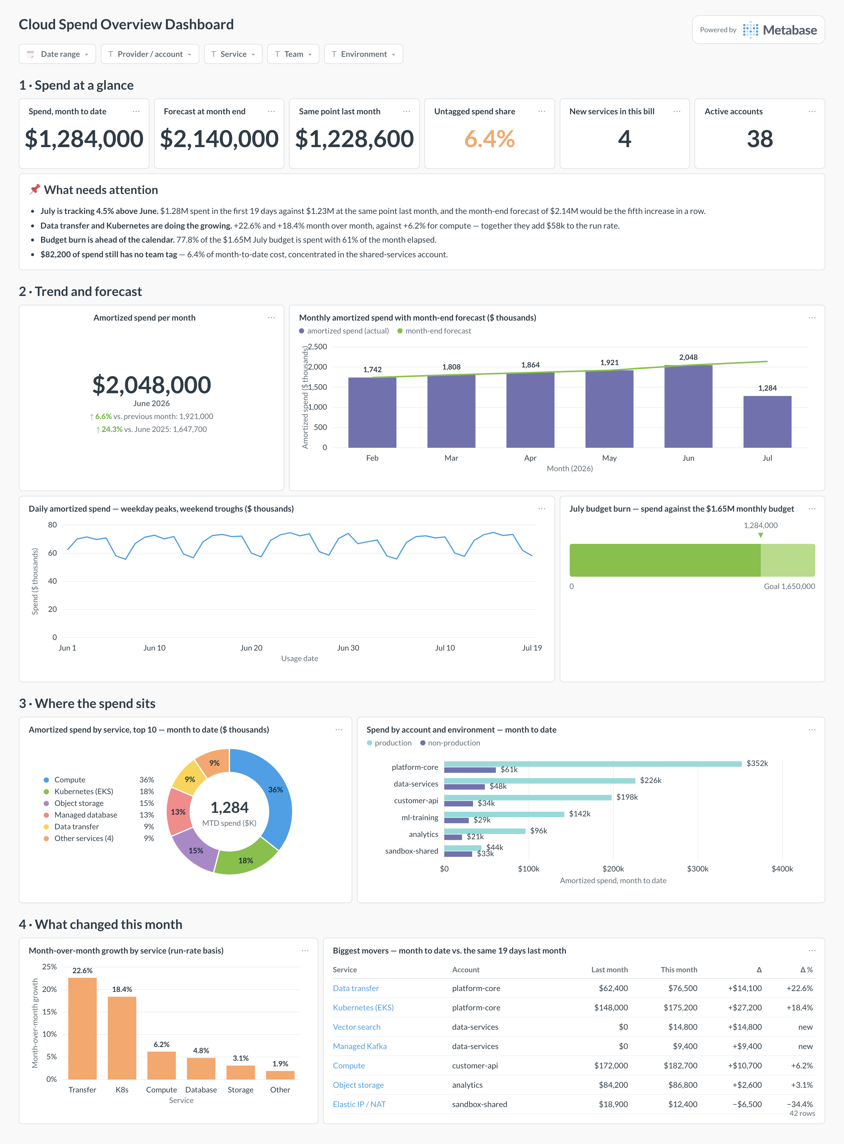
Which cards belong on this dashboard?
- Total spend month to date vs. same point last month
- Amortized spend by service, top 10
- Spend by account or project and environment
- Daily spend trend with weekly seasonality visible
- Month-over-month growth by service
- Budget burn vs. days elapsed
- New services appearing in the bill this month
- Untagged spend share
What data does this dashboard need?
- Daily cost rollups by service, account, team, and environment
- An explicit amortized vs. unblended cost convention
- Credits, refunds, and taxes modeled separately from usage cost
- Budget targets by month for the burn view
- Tag or label mappings for team attribution
How do you build it?
- Land billing exports or cost-platform data in a database and keep raw line items, tags, timestamps, and pricing models.
- Build rollup models at the grain this dashboard needs, with cost conventions (amortized, unblended, net) as explicit columns.
- Create one saved question per card and certify the shared models and definitions.
- Add dashboard filters for Date range, provider or account, service, team, environment.
- Show data freshness — billing exports lag, and every viewer should see by how much.
Example card SQL
Month-to-date spend vs. the same point last monthPostgreSQL
WITH period AS (
  -- Both windows cover the same number of *completed* days, so the
  -- comparison isn't skewed by today's partial (and lagging) data.
  SELECT
    date_trunc('month', CURRENT_DATE)::date AS current_start,
    (date_trunc('month', CURRENT_DATE) - INTERVAL '1 month')::date
      AS prior_start,
    CURRENT_DATE - date_trunc('month', CURRENT_DATE)::date AS days_elapsed
), mtd AS (
  SELECT
    'current' AS period,
    SUM(r.amortized_cost_usd) AS cost
  FROM cost_daily_rollups r
  CROSS JOIN period p
  WHERE r.usage_date >= p.current_start
    AND r.usage_date < p.current_start + p.days_elapsed
  UNION ALL
  SELECT
    'prior',
    SUM(r.amortized_cost_usd)
  FROM cost_daily_rollups r
  CROSS JOIN period p
  WHERE r.usage_date >= p.prior_start
    AND r.usage_date < p.prior_start + p.days_elapsed
)
SELECT
  MAX(cost) FILTER (WHERE period = 'current') AS mtd_spend,
  MAX(cost) FILTER (WHERE period = 'prior') AS prior_mtd_spend,
  ROUND(
    100.0 * (MAX(cost) FILTER (WHERE period = 'current')
      - MAX(cost) FILTER (WHERE period = 'prior'))
    / NULLIF(MAX(cost) FILTER (WHERE period = 'prior'), 0), 1
  ) AS mtd_growth_pct
FROM mtd;
Related
Dashboards
Integrations
Metrics
Analytics
FAQ
Should the headline number be amortized or unblended cost?
Amortized for management views — it spreads commitment prepayments over the usage they cover, so trends reflect consumption. Keep an unblended card for invoice reconciliation, clearly labeled.
Why does the current month look artificially low?
Billing exports lag by hours to days, and some charges (support fees, taxes, credits) post late or at month end. Compare month-to-date against the same day count last month, not the full month.