What goes in an email marketing dashboard in Metabase?
An email marketing dashboard runs the whole program from one screen: whether the list is growing faster than it churns, how campaigns perform, what each send earns, whether mail is actually reaching inboxes, and what the automation flows contribute. It's the weekly review layer above the metric-by-metric detail in an email engagement dashboard.
For: lifecycle and email marketers, marketing ops. Grain: one row per recipient per event, rolled up to campaign and month. Source: ESP event exports (Mailchimp, Klaviyo, Customer.io) joined to orders.
What does an email marketing dashboard look like?
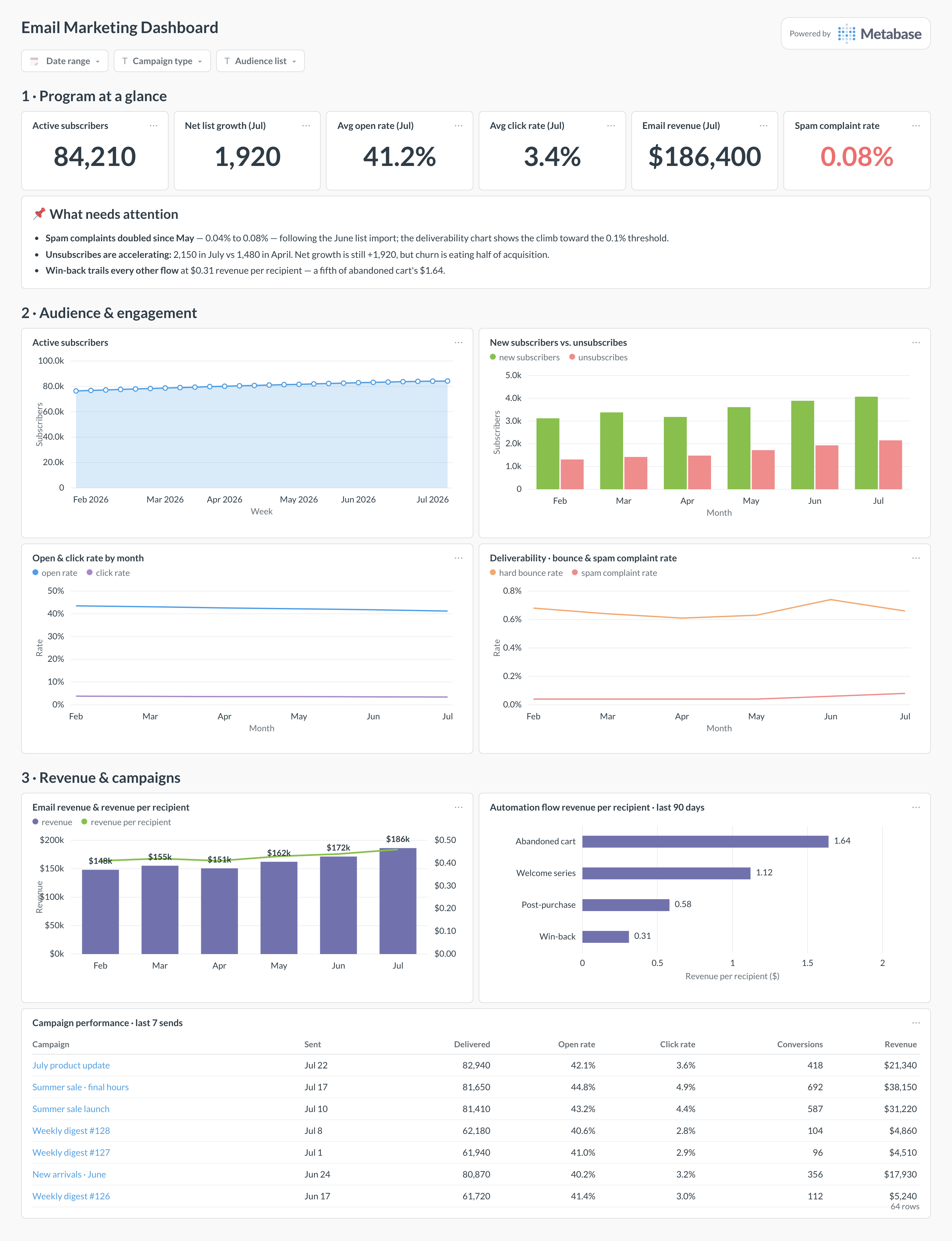
Here’s the layout this guide builds. Program numbers — subscribers, rates, revenue, complaints — sit at the top for the weekly read. Audience and engagement trends come next, with deliverability beside them because a complaint spike explains an engagement dip more often than content does. Revenue and the campaign table sit at the bottom, where individual sends get compared.
An example email marketing dashboard in Metabase, built from ESP event data joined to orders. Figures are illustrative.
Which cards belong on an email marketing dashboard?
The eight below cover audience, engagement, deliverability, and revenue — the four ways an email program succeeds or quietly fails.
Program numbers — active subscribers, open and click rates, monthly email revenue, spam complaint rate (numbers)
Active subscribers over time, weekly (area)
New subscribers versus unsubscribes per month (bar)
Open and click rate trend by month (line)
Deliverability — hard bounce and spam complaint rates (line)
Email revenue and revenue per recipient per month (combo)
Campaign performance — delivered, open, click, conversions, and revenue per campaign (table)
What data does the dashboard need?
An email_events table with one row per recipient per event — sent, delivered, opened, clicked, bounced, spam_complaint, unsubscribed — with timestamps and campaign or flow IDs.
A campaigns table (name, type, subject, sent_at, audience) and a flows table for automations.
A subscribers table with subscribed_at, unsubscribed_at, and status, to compute list size and net growth over time.
An orders table with an attribution link back to the campaign or flow, for revenue per send.
Bounce classification (hard versus soft) — the deliverability cards need hard bounces separated out.
How do you build it?
Sync your ESP’s event-level data to the warehouse — the Mailchimp and Klaviyo guides cover connector options — and land orders beside it.
Build one Metabase model over email_events that defines every rate once: opens and clicks over delivered, bounces over sent, complaints over delivered.
Pick and encode the revenue attribution rule (say, click-to-purchase within 5 days) in the model, so campaign revenue and monthly revenue always agree.
Compute daily list size from the subscribers table as a running sum of subscribes minus unsubscribes and hard bounces, and snapshot it if your ESP overwrites status.
Add filters for date range, campaign type, and audience list, then wire an alert on the spam complaint card at 0.1% so deliverability problems don’t wait for the weekly review.
Example card SQL
Campaign performance: delivery, clicks, bounces, and attributed revenuePostgreSQL
SELECT
c.campaign_name,
c.sent_at::date                              AS send_date,
COUNT(*) FILTER (WHERE e.event = 'delivered') AS delivered,
ROUND(
  100.0 * COUNT(DISTINCT e.recipient_id)
    FILTER (WHERE e.event = 'clicked')
  / NULLIF(COUNT(*) FILTER (WHERE e.event = 'delivered'), 0), 2
)                                            AS click_rate_pct,
ROUND(
  100.0 * COUNT(*) FILTER (WHERE e.event = 'bounced')
  / NULLIF(COUNT(*) FILTER (WHERE e.event = 'sent'), 0), 2
)                                            AS bounce_rate_pct,
SUM(o.order_total) FILTER (
  WHERE o.ordered_at <= e.event_at + INTERVAL '5 days'
)                                            AS attributed_revenue,
ROUND(
  SUM(o.order_total)
  / NULLIF(COUNT(*) FILTER (WHERE e.event = 'delivered'), 0), 2
)                                            AS revenue_per_recipient
FROM campaigns c
JOIN email_events e USING (campaign_id)
LEFT JOIN orders o
ON o.customer_id = e.recipient_id
AND o.attributed_campaign_id = c.campaign_id
WHERE c.sent_at >= NOW() - INTERVAL '90 days'
GROUP BY 1, 2
ORDER BY send_date DESC;
How is this different from an email engagement or newsletter growth dashboard?
Altitude. An email engagement dashboard goes deep on the engagement metrics themselves — opens, clicks, and unsubscribes cut by segment, send time, and device — and a newsletter growth dashboard tracks one publication's audience. This dashboard is the program view: list health, campaign results, revenue, and deliverability on one screen, so the weekly email review doesn't need four tabs. When an engagement number here looks off, the engagement dashboard is where you go to find out why.
Can I still trust open rates?
Only directionally. Apple Mail Privacy Protection pre-fetches tracking pixels for a large share of most B2C lists, which inflates open rates and flattens real differences between campaigns — a 41% open rate can hide anywhere from 25% to 60% of genuine opens. Keep the open rate on the dashboard because subject-line tests still move it, but make click-through rate and conversions the numbers you judge campaigns by, and never segment "unengaged" subscribers for pruning on opens alone — you will delete Apple Mail readers who click.
How should I calculate revenue per send?
Pin down the attribution window and the denominator, because ESPs differ and the defaults are generous. Klaviyo, for example, defaults to a five-day window that counts anyone who clicked or opened before purchasing; a click-only window of 3–5 days is the stricter, more defensible choice. Divide by delivered, not sent, so bounces don't dilute the number. Whichever you choose, compute it yourself in the warehouse with one SQL definition — then the campaign table and the monthly revenue chart can't quietly use two different windows.
What deliverability numbers should worry me?
Two thresholds matter more than the rest: spam complaint rate and hard bounce rate. Gmail and Yahoo's bulk-sender rules require complaint rates below 0.3% with 0.1% as the working target — sustained readings above that get future sends routed to spam for everyone, not just complainers. Hard bounce rate above roughly 2% signals a stale or purchased list. Chart both as trends rather than single readings: the failure mode is a slow climb after a list import, which is invisible in any one campaign report.
How do I get Mailchimp or Klaviyo data into Metabase?
Through your warehouse. Both platforms expose campaign, flow, list, and event-level data via API, and standard ETL connectors land it in Postgres, BigQuery, or Snowflake on a schedule — the Mailchimp and Klaviyo guides walk through the options. The event tables are what you want: per-recipient sends, opens, clicks, bounces, and unsubscribes let you compute every rate on this dashboard with one consistent set of definitions, and join email behavior to orders and subscriptions — which no ESP's built-in reporting can do.
Should campaigns and automation flows share one dashboard?
Share the dashboard, never the aggregates. A welcome flow converting at 8% averaged with newsletters at 0.5% produces a blended number that describes neither, and a shift in send mix will move it while nothing real changed. This layout keeps them side by side but separate: campaigns get the performance table and the revenue trend, flows get their own revenue-per-recipient comparison. That comparison is also where the money usually is — flows typically produce a quarter to half of email revenue from a fraction of the send volume, which the flow card makes visible.
What's a healthy list growth rate?
Positive net growth — new subscribers minus unsubscribes and hard bounces — with churn under control is the honest target; a common benchmark is 2–4% monthly list growth for an actively promoted list. Watch the composition, not just the net: 4,000 new subscribers against 2,200 unsubscribes is a very different program from 2,000 against 200, even though the nets are close. And a paid-acquisition spike that raises complaint rates costs more in deliverability than the subscribers are worth — which is why this dashboard keeps growth and deliverability on the same screen.