




What goes in an IT risk dashboard in Metabase?
An IT risk dashboard turns the risk register into analytics: a likelihood-by-impact matrix, treatment status, overdue mitigations by owner, and whether the register is shrinking or quietly growing. It's built for governance — the risk committee and audit — and sits between the IT compliance dashboard below it and the executive rollup above it. Metabase builds it from a GRC export or a risks table in your warehouse.
For: CIOs, risk committees, and internal audit. Grain: one row per risk, plus one per mitigation task. Refresh: daily sync; monthly risk-review cadence.
What does an IT risk dashboard look like?
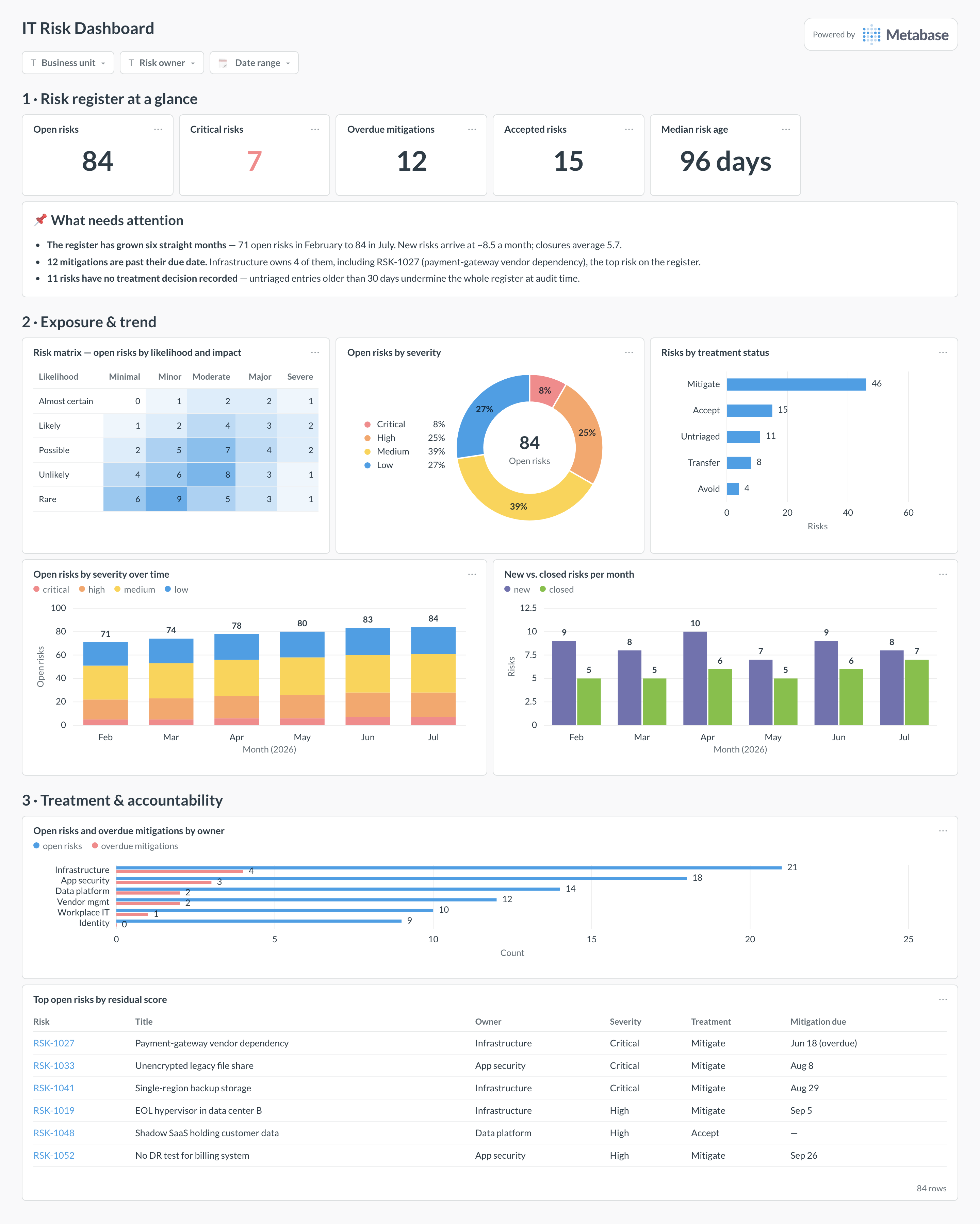
Here’s the layout this guide builds. The register headline — open, critical, overdue, accepted, median age — opens the page; exposure comes next, with the risk matrix, the severity mix, and the trend that shows whether the register is growing faster than it closes; treatment and accountability sit at the bottom, ending in the top-risks table the monthly review walks through.
Which cards belong on an IT risk dashboard?
The eight below answer the four questions a risk committee actually asks: where is the exposure, is it growing, what are we doing about it, and who is late?
- Risk matrix — open-risk counts by likelihood and impact (pivot table with conditional formatting)
- Open risks by severity — critical through low, with the total (donut)
- Risks by treatment status — mitigate, accept, transfer, avoid, and untriaged (row)
- Open risks by severity over time — is the register growing, and in which band (stacked bar)
- New vs. closed risks per month — intake against closure velocity (bar)
- Open risks and overdue mitigations by owner — accountability in one chart (row)
- Median risk age — how long the register holds a risk (number)
- Top open risks by residual score — the worklist, with owner, treatment, and mitigation due date (table)
What data does the dashboard need?
- A
riskstable —risk_id, title,likelihood,impact,severity,treatment,owner,opened_at,closed_at,status. - Fixed five-level scales for likelihood and impact, stored as values from a controlled list — the matrix is only as honest as these columns.
- A
mitigationstable withrisk_id,due_at,completed_at, and owner, for the overdue cards. - Acceptance records — acceptor, rationale,
review_at— so “accepted” risks carry an expiry like any other treatment. - A monthly snapshot of open-risk counts by severity (or reliable
opened_at/closed_atstamps) to draw the register trend.
How do you build it?
- Get the register into the warehouse: GRC platforms export via API, and a spreadsheet register uploads directly to Metabase — normalize likelihood, impact, treatment, and owner to controlled values first.
- Build the matrix as a query grouped by likelihood and impact, shown as a pivoted table with conditional formatting — the heat-map read is the point.
- Model “overdue mitigation” once (
due_atpast,completed_atnull) and reuse it in the KPI, the by-owner chart, and the top-risks table so the numbers always agree. - Create the trend from monthly snapshots of open risks by severity — the register table alone can’t tell you what April looked like once rows close.
- Add filters for business unit, risk owner, and date range, and subscribe the risk committee to a monthly digest timed to land before the review meeting.
Example card SQL
SELECT
r.likelihood,
r.impact,
COUNT(*)                                              AS open_risks,
COUNT(*) FILTER (WHERE r.severity = 'critical')       AS critical,
COUNT(*) FILTER (WHERE r.treatment = 'untriaged')     AS untriaged,
COUNT(*) FILTER (
  WHERE m.due_at < now() AND m.completed_at IS NULL
)                                                     AS overdue_mitigations,
ROUND(AVG(
  EXTRACT(day FROM now() - r.opened_at)
))                                                    AS avg_age_days
FROM risks r
LEFT JOIN mitigations m USING (risk_id)
WHERE r.status = 'open'
GROUP BY r.likelihood, r.impact
ORDER BY
array_position(
  ARRAY['almost_certain','likely','possible','unlikely','rare'],
  r.likelihood
),
array_position(
  ARRAY['minimal','minor','moderate','major','severe'],
  r.impact
);
Related
Metrics
Integrations
Dashboards
FAQ
What is an IT risk dashboard, and who is it for?
Our register is a spreadsheet. How do we get to a dashboard?
risks table plus a mitigations table with due dates gives you every card on this page. GRC tools export the same shape when you outgrow the sheet.